Sidebar Navigation System
Collection-aware sidebar with auto, collection, categories, tags, and tree modes plus scroll spy, keyboard shortcuts, and swipe gestures.
Table of Contents
Enhanced Sidebar Navigation System
The Zer0-Mistakes theme includes a modern sidebar navigation system with performance-optimized scroll tracking and accessibility features.
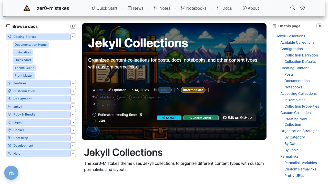
The Browse docs sidebar on the left is the enhanced navigation system; the On this page panel on the right is the table of contents.
Overview
Key features:
- Intersection Observer: 70% reduction in scroll event overhead
- Smooth Scrolling: Offset-aware with URL updates
- Keyboard Shortcuts: Section navigation with
[and] - Swipe Gestures: Mobile-friendly edge swipes
- Focus Management: Accessible navigation flow
Components
Left Sidebar
Site-wide navigation panel rendered by the default layout:
{% include navigation/sidebar-left.html %}
The panel resolves its content through two shared includes — used by the desktop sidebar, the mobile offcanvas, and the optional unified drawer, so they can never drift apart:
| Include | Role |
|---|---|
navigation/sidebar-config.html |
Resolves the effective mode, title, and icon for the current page |
navigation/sidebar-nav.html |
Renders the resolved mode |
navigation/sidebar-folders.html |
collection mode — live folder tree of a collection |
navigation/sidebar-categories.html |
categories / tags modes — posts grouped by taxonomy |
navigation/nav-tree.html |
Curated _data/navigation/*.yml trees |
Navigation Modes
Set the mode with the sidebar.nav front matter key (or a collection/site default — see Configuration):
| Mode | Renders | Best for |
|---|---|---|
auto |
The best mode for the page’s collection (see below) | Zero-config defaults |
collection |
Live, collapsible folder tree of the page’s collection documents | Notes, notebooks, any growing collection |
categories |
Posts grouped by category, with post counts | Blogs organized by category |
tags |
Posts grouped by tag, with post counts | Tag-driven blogs |
| any other value | _data/navigation/<value>.yml rendered as a curated tree |
Hand-ordered docs (e.g. nav: docs) |
How auto resolves
auto picks the most useful mode for the page, based on its collection:
- Curated tree wins — if
_data/navigation/<collection>.ymlexists (e.g.docs.ymlfor thedocscollection), it is rendered withnav-tree.html. - Collection tree — otherwise, a page inside a collection gets the live
collectionfolder tree. - Categories — pages outside any collection fall back to post categories (when the site has posts with categories).
The left column is only rendered when the resolved mode actually has content, so a page never reserves an empty sidebar column.
Collection mode options
collection mode groups the collection’s documents by sub-folder into collapsible sections. A folder’s index.md becomes the folder link itself; folder names are humanized (getting-started → “Getting started”); and the group containing the current page starts expanded. Options (all optional):
sidebar:
  nav: collection
  collection: docs   # list a different collection than the page's own
  sort: title        # path (default) | title | date
  reverse: true      # reverse the sort (e.g. newest-first with sort: date)
  expand: true       # expand every folder group (default: active group only)
Hide an individual document from the tree with sidebar_exclude: true in its front matter.
Categories / tags mode options
sidebar:
  nav: categories    # or tags
  limit: 10          # max posts listed per term (default: all)
Note: Jekyll only indexes posts in site.categories / site.tags, so these modes list posts, not collection documents.
Configuration
Settings resolve most-specific-first: page front matter → collection metadata → site config → theme defaults.
Page front matter
sidebar:
  nav: docs            # mode or _data/navigation file (see table above)
  title: "Guides"      # panel heading override
  icon: bi-book        # Bootstrap Icons class for the heading
sidebar: false         # or: hide the sidebar (and TOC) entirely
Collection metadata (_config.yml)
collections:
  notes:
    output: true
    title: Notes               # heading for the collection tree
    icon: bi-journal-richtext  # Bootstrap Icons class
    sidebar:
      nav: collection          # default mode for pages in this collection
Site defaults (_config.yml)
sidebar:
  title: "Browse docs"         # default panel heading
  icon: "bi-journal-bookmark"  # default heading icon
  nav: auto                    # optional site-wide fallback mode
Front-matter defaults remain the conventional way to assign modes per content path (this theme sets nav: auto for docs/about/quickstart and notes/notebooks in its own _config.yml defaults: block).
Right Sidebar (Table of Contents)
Page-specific heading navigation:
{% include navigation/sidebar-right.html %}
Features:
- Auto-generated from headings
- Scroll spy highlighting
- Floating action button on mobile
Scroll Spy
How It Works
Uses Intersection Observer for performance:
const observer = new IntersectionObserver(
  (entries) => {
    entries.forEach((entry) => {
      if (entry.isIntersecting) {
        highlightTocLink(entry.target.id);
      }
    });
  },
  { rootMargin: '-20% 0% -70% 0%' }
);
Configuration
// Adjust observer margins
const scrollSpyConfig = {
  rootMargin: '-20% 0% -70% 0%',
  threshold: 0
};
Active Section Highlighting
Active TOC links receive the .active class:
.toc-link.active {
  color: var(--bs-primary);
  font-weight: 600;
  border-left: 2px solid var(--bs-primary);
}
Smooth Scrolling
Offset-Aware Navigation
Accounts for fixed header:
function scrollToSection(id) {
  const element = document.getElementById(id);
  const headerOffset = 80; // Fixed header height
  const elementPosition = element.getBoundingClientRect().top;
  const offsetPosition = elementPosition + window.scrollY - headerOffset;

  window.scrollTo({
    top: offsetPosition,
    behavior: 'smooth'
  });
}
URL Updates
URLs update without page reload:
history.pushState(null, '', `#${sectionId}`);
Keyboard Navigation
Available Shortcuts
| Key | Action |
|---|---|
[ |
Previous section |
] |
Next section |
Esc |
Close sidebar |
Tab |
Navigate links |
Implementation
document.addEventListener('keydown', (e) => {
  // Only when not in input
  if (e.target.matches('input, textarea')) return;

  if (e.key === '[') navigateToPrevSection();
  if (e.key === ']') navigateToNextSection();
});
Swipe Gestures
Touch Navigation
| Gesture | Action |
|---|---|
| Swipe right from left edge | Open left sidebar |
| Swipe left from right edge | Open TOC |
Configuration
const swipeConfig = {
  threshold: 50,     // Minimum swipe distance
  edgeZone: 30       // Edge detection area
};
Mobile Experience
Floating Action Button
TOC button on mobile:
<div class="d-lg-none position-fixed bottom-0 end-0 p-3">
  <button class="btn btn-primary rounded-circle shadow-lg"
          data-bs-toggle="offcanvas"
          data-bs-target="#tocSidebar">
    <i class="bi bi-list-ul"></i>
  </button>
</div>
Offcanvas Sidebar
Bootstrap 5 offcanvas for mobile:
<div class="offcanvas offcanvas-end" id="tocSidebar">
  <div class="offcanvas-header">
    <h5>On This Page</h5>
    <button type="button" class="btn-close" data-bs-dismiss="offcanvas"></button>
  </div>
  <div class="offcanvas-body">
    {% include content/toc.html %}
  </div>
</div>
Customization
Sidebar Width
/* Left sidebar */
.sidebar-left {
  width: 280px;
}

/* Right sidebar (TOC) */
.sidebar-right {
  width: 250px;
}

/* Responsive */
@media (max-width: 991px) {
  .sidebar-left,
  .sidebar-right {
    width: 100%;
  }
}
Icons
Using Bootstrap Icons throughout:
<i class="bi bi-folder2-open"></i>  <!-- Categories -->
<i class="bi bi-file-earmark-text"></i>  <!-- Documents -->
<i class="bi bi-list-ul"></i>  <!-- TOC toggle -->
Colors
/* Sidebar theming */
.sidebar {
  --sidebar-bg: var(--bs-body-bg);
  --sidebar-text: var(--bs-body-color);
  --sidebar-active: var(--bs-primary);
}
Performance
Optimizations Implemented
- Intersection Observer vs scroll events
- Debounced handlers (100ms delay)
- Lazy initialization (only when TOC exists)
- CSS transitions (hardware accelerated)
- Efficient queries with error handling
Metrics
- Scroll event reduction: 70%
- Paint reduction: 50%
- Memory usage: Minimal
Troubleshooting
Scroll Spy Not Working
- Check heading IDs exist
- Verify TOC links match heading IDs
- Check Intersection Observer support
Keyboard Shortcuts Disabled
- Ensure not in input field
- Check for conflicting shortcuts
- Verify JavaScript loaded
Mobile Sidebar Issues
- Check offcanvas target
- Verify Bootstrap JS loaded
- Test touch events
Related
Technical Reference
For implementation details (scroll spy, swipe gestures, keyboard shortcuts, ARIA improvements):
- Navigation Redesign → docs/implementation/navigation-redesign.md
- Sidebar improvements → docs/implementation/feature-change-log.md
See also
- [[Features]]
- [[Breadcrumbs Navigation]]
- [[Mobile TOC Floating Action Button]]